So, free stock videos. They’re awesome, right? They save you time, make your content look good, and honestly, if you’re a small brand or just starting out, they can be a lifesaver. But here’s the thing — if you just grab a clip and post it, it still looks… well… stock. Kind of generic. Like something everyone else could be using.
I’ve been there. You think, “This is fine,” but it’s just not quite right. Over the years I’ve learned a few simple tweaks that make these clips feel more mine, more on-brand, and they don’t take forever.
Play With Your Brand Colors
Even tiny changes in color can make a clip feel like it belongs to your brand.
- Add a subtle overlay with your brand’s colors.
- Bright, playful brands? Bump the saturation a bit.
- Minimal, calm brands? Keep it muted.
Honestly, sometimes I just throw a color filter on a clip and it instantly feels cohesive. Canva, Fotor, or even Pikwizard’s online editor works for this — no fancy software needed.
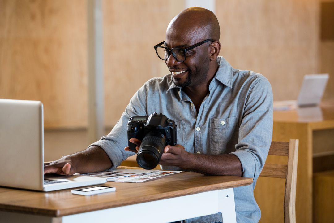
Free Stock Photo By Pikwizard.com
Cut the Stuff You Don’t Need
Stock videos often have extra movement, weird pans, or background clutter.
- Crop and zoom to focus on what matters.
- Trim the start and end so it’s snappy.
- Shorter is almost always better on social — people scroll fast.
A few seconds of tight, focused footage looks way more intentional than a long “meh” clip.
Add Your Logo or Text
This is where your brand really comes in. Even a small logo in the corner, a simple text overlay, or a little animated icon makes a huge difference.
- Tiny graphics or animations can highlight something important without being distracting.
- Logos help viewers recognize your content instantly.
- Text overlays can explain what’s happening or give context.
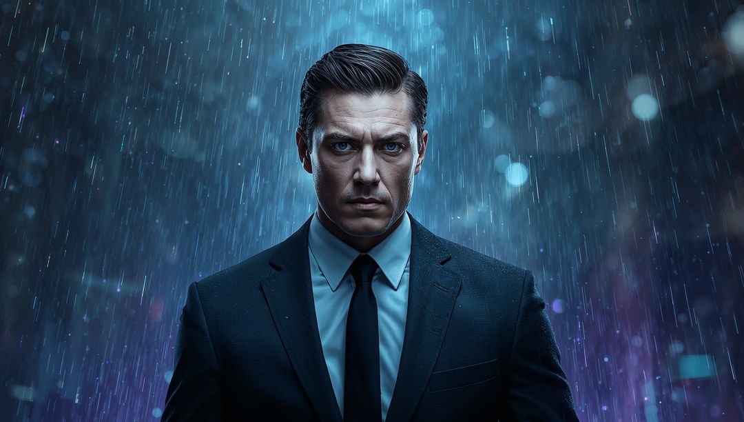
Free Stock Image By Pikwizard.com
Make the Mood Match Your Brand
Not every stock clip works for every brand. A moody, cinematic clip might look amazing, but if your brand is fun and colorful, it just feels wrong.
- Adjust colors, brightness, and contrast to match your vibe.
- Keep the pacing consistent across clips.
- Make sure any added text or graphics feel part of the same style.
Sound Matters
Even a short clip feels flat without audio.
- Add music or subtle background sound.
- Keep it at a comfortable volume so text or voiceovers aren’t drowned out.
- Using the same style of sound across videos makes them feel like a cohesive series.
Keep Things Consistent
If you’re using multiple clips, consistency is key.
- Apply the same color tweaks or filters across all clips.
- Keep pacing and transitions similar.
- Keep logos and text in roughly the same place.
When it’s consistent, it looks professional. When it’s not, people notice.
My Way Of Editing Videos
Editing stock videos doesn’t have to be complicated. You don’t need a video team or expensive tools. A few tweaks — color, cropping, overlays, resizing — and suddenly a generic clip looks polished and yours. Start with good stock videos (I personally like Pikwizard Free Videos Library), spend a few minutes customizing them, and you’ll have content that feels professional, cohesive, and unique.
FAQ: Making Free Stock Videos Look Professional and On-Brand
1. Are free stock videos actually safe for business use?
They can be—as long as the license clearly allows commercial use.
When I’m using free stock footage from libraries (like Pikwizard’s Free Videos Library), I always check:
- Does it say “free for commercial use” or similar?
- Are there any restrictions (no resale, no redistribution, no use in logos, etc.)?
- Does it require attribution?
If I can’t clearly see that commercial use is allowed, I simply don’t use that clip in a client or brand project.
2. What resolution should I use for social media vs websites?
A quick rule of thumb:
- Social media:
- Vertical (Reels, TikTok, Shorts): 1080 × 1920 (9:16)
- Square (some feeds/ads): 1080 × 1080 (1:1)
- Horizontal (YouTube, some FB/LinkedIn): 1920 × 1080 (16:9)
- Web / landing pages:
- 1920 × 1080 or higher is usually safe for hero sections and background videos.
I always download the highest resolution available from the stock site and then export different versions for each platform as needed. Upscaling a tiny clip rarely looks good.
3. How long should stock video clips be for social?
Shorter than you think.
For most platforms:
- 3–8 seconds is plenty for a background or b-roll clip.
- For Reels/TikToks/Shorts, the total video might be 10–30 seconds, made of multiple short clips.
I almost always:
- Trim the clip to the most interesting movement
- Cut out slow starts and lingering endings
- Use tight edits to match the beat of the music or the rhythm of the voiceover
If a clip feels boring at normal speed, I either cut it down or don’t use it.
4. How do I make a stock video look less “stocky”?
I think in terms of layers:
- Color – Apply a subtle color grade or overlay in your brand colors.
- Cropping – Zoom into the most relevant part of the frame.
- Text & graphics – Add your headline, captions, or icons.
- Logo – A small, consistent logo placement makes it feel like your content.
Even basic tools like Canva, Fotor, or Pikwizard’s online editor are enough for these tweaks. You don’t need pro editing software to make a big difference.
5. Can I mix multiple stock clips in one video?
Absolutely—and it often looks more premium when done right.
To keep it cohesive:
- Use clips with similar lighting and mood
- Apply the same color filter or adjustments to all clips
- Keep transitions simple (cuts or fades are better than crazy effects)
- Match the pacing of your edits to the music or voiceover
I usually pick 3–5 clips from the same series or with a similar style, then treat them all with the same edit so they feel like they belong together.
6. Do I need to credit the source of the video?
It depends on the license:
- Some free libraries: Attribution required (you must credit the creator/website)
- Others: Attribution appreciated but not required
Even when attribution is optional, adding a small credit in the description (e.g. “Video via Pikwizard”) is:
- Professionally respectful
- Helpful for your own records
- Good for transparency, especially in blog posts or long-form content
For short social clips or ads where on-screen credit doesn’t fit, I often keep credits in the caption or document them internally.
7. What about music and sound—can I just use any track I find?
This is where a lot of people get into trouble.
Video footage might be cleared for commercial use, but music is a separate license. I never:
- Grab random songs from YouTube, Spotify, or iTunes
- Assume a track is free just because it appears in an editing app
Instead, I use:
- The app’s own licensed audio library (e.g. in Reels/TikTok tools)
- Royalty-free or commercial-use music libraries
- Tracks where the license clearly covers my intended use
If I’m adding voiceover, I make sure the background music is:
- At a lower volume than the voice
- Not distracting or full of vocals that clash with the message
8. How important is aspect ratio for stock videos?
Very important. The same clip can look amazing in one format and terrible in another.
Common aspect ratios:
- 9:16 – Vertical (TikTok, Reels, Shorts, Story formats)
- 16:9 – Horizontal (YouTube, most desktop players)
- 1:1 – Square (some feeds and ads)
When using stock video, I:
- Start with a high-res horizontal clip
- Reframe/crop it for vertical or square inside the editor
- Always check how key elements look on mobile, not just in the editing window
If a clip can’t be cropped without losing the subject, I pick a different one.
9. How can I make videos more accessible and watchable without sound?
Most people watch social video with the sound off at first.
To improve both accessibility and engagement:
- Add burned-in captions or subtitles for spoken content
- Use clear on-screen text to highlight the main message
- Make sure important visuals aren’t covered by UI elements (like platform buttons or captions)
Even simple text overlays explaining what’s happening can massively increase watch time and comprehension.
10. How do I keep my video content consistent across multiple posts?
Consistency is what makes your content look intentional and professional.
I try to standardize:
- Color grading – Same type of filter or overlay across videos
- Fonts – One or two fonts used everywhere
- Logo placement – Same corner, same size, same opacity
- Text style – Same animation style, similar timing
- Music style – Similar genre/mood for a recognizable vibe
I’ll often create a “base template” in Canva, Fotor, or another editor, then swap out clips and text for each new video.
11. When should I stop using stock and create custom footage?
Stock video is perfect for:
- General themes (lifestyle, nature, cityscapes, office scenes)
- Backgrounds, b-roll, and supporting visuals
- Early-stage brands or small projects
But I consider custom footage when:
- I need product-specific shots or unique brand storytelling
- The brand is scaling and wants a truly distinctive look
- I’m repeating the same stock clips too often in high-visibility campaigns
A common middle ground is: use stock for supporting visuals, and mix in custom shots for anything core to your brand identity (product demos, behind-the-scenes, team content).
Leave a Reply